Claro Checkout
A complex checkout flow for one of the biggest Telecom in Latin America
Claro is one of the largest telecommunications providers in Brazil, offering mobile, broadband, fixed-line, and satellite television services. Fbizz partnered with Claro across multiple digital initiatives, ranging from mobile apps to email marketing.
One of the main challenges was redesigning the checkout flow while meeting strict data security requirements and complying with Brazilian telecommunications regulations. This case study summarizes the flow analysis and design work behind that effort.
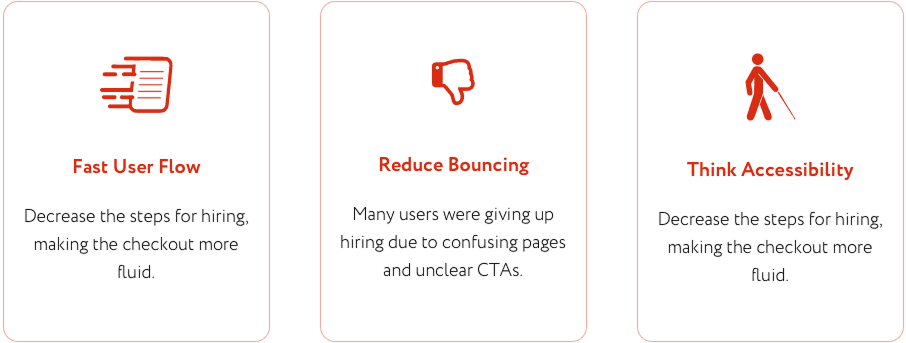
The primary mission was to resolve recurring issues in the internet and mobile service hiring flow, which involved too many steps and caused user confusion.
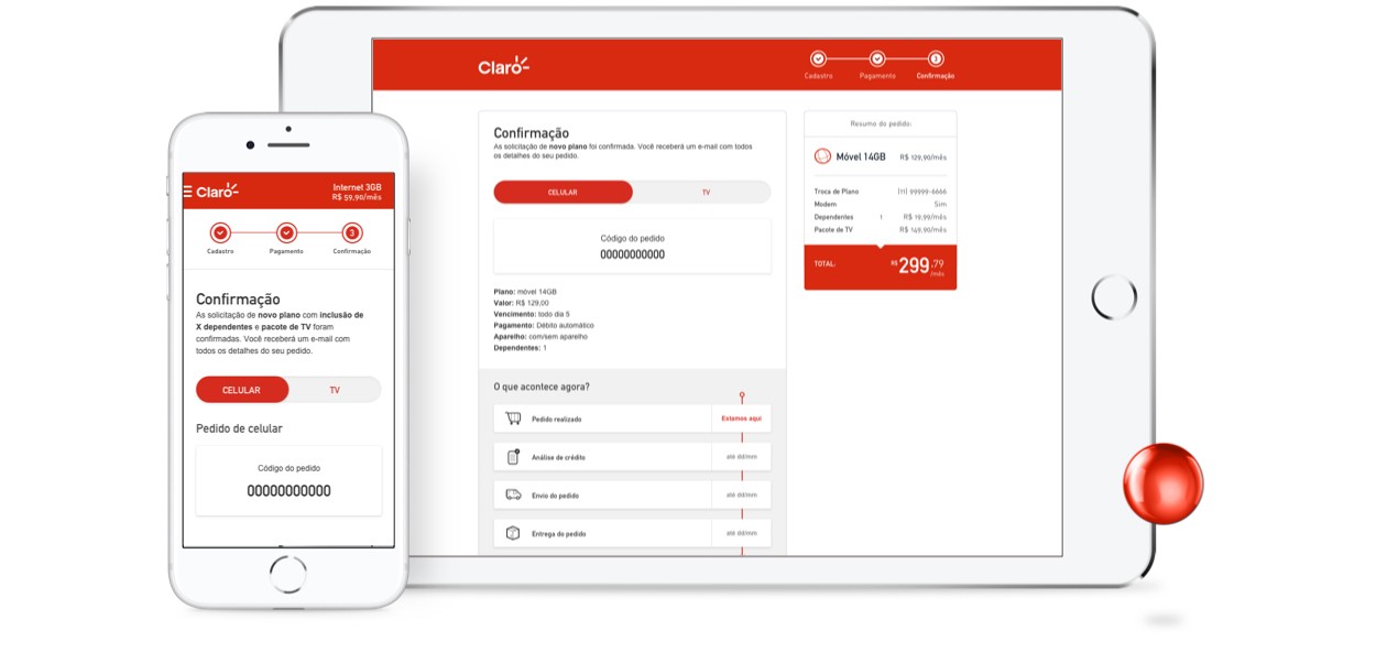
The redesigned experience focused on simplifying the flow, improving clarity, and ensuring full accessibility. These improvements aimed to increase user satisfaction and encourage repeat purchases.
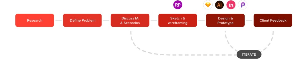
Claro’s e-commerce team approached us with a deceptively simple goal: make the checkout flow more fluid and accessible. We began with user research focused on behavior during the checkout process, identifying the most critical pain points in the existing flow.
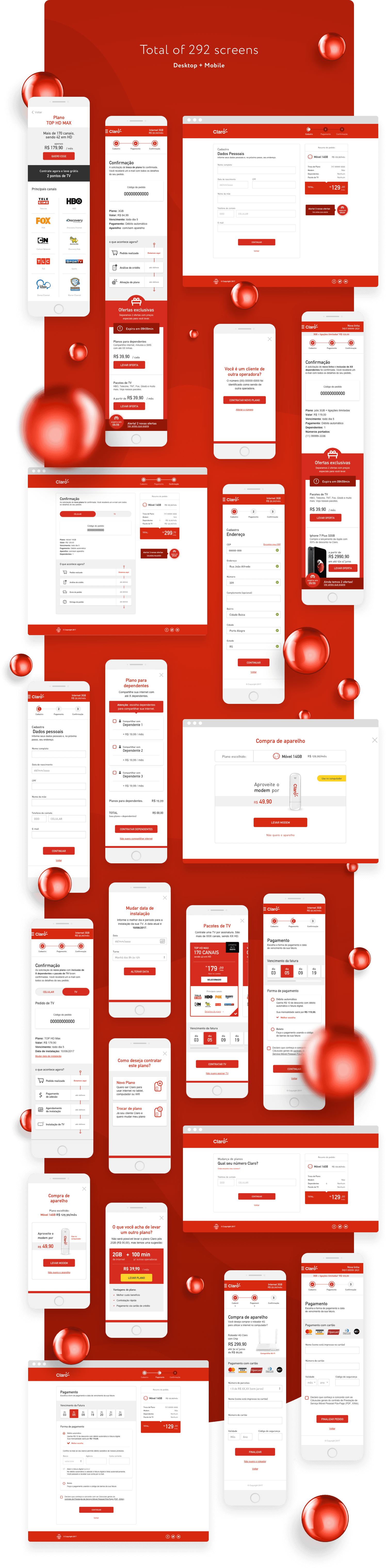
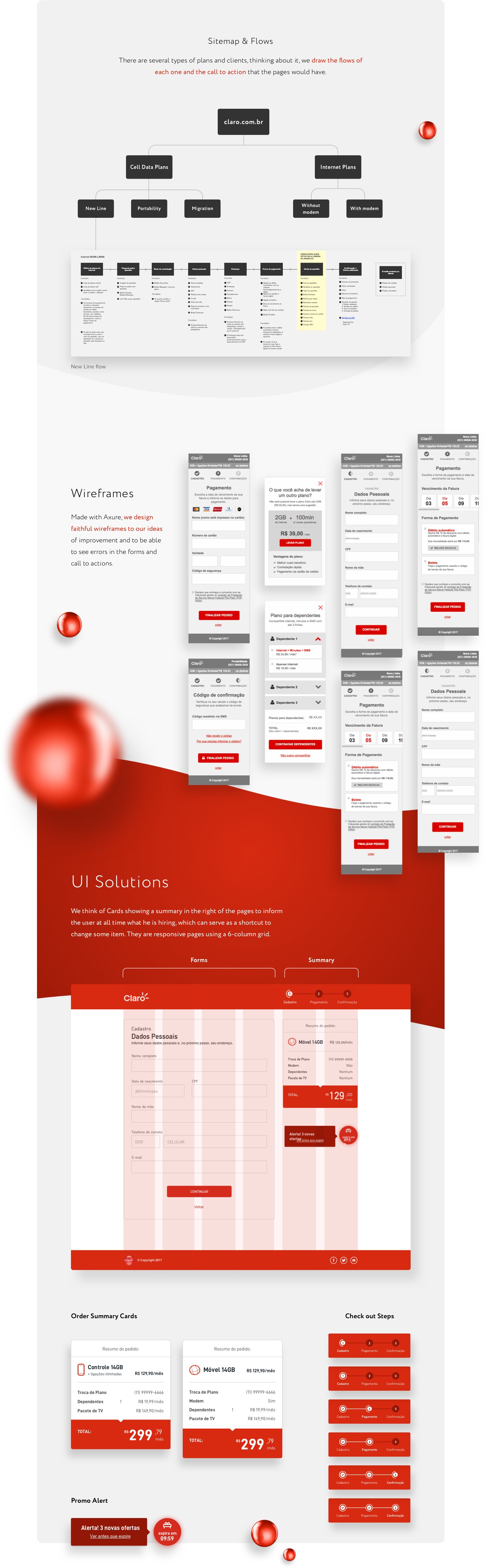
With these insights, we explored usability scenarios and tested visual solutions aimed at reducing friction and simplifying decision-making. We then designed the full set of wireframes and flows, carefully minimizing unnecessary steps to shorten the journey and reduce bounce rates.
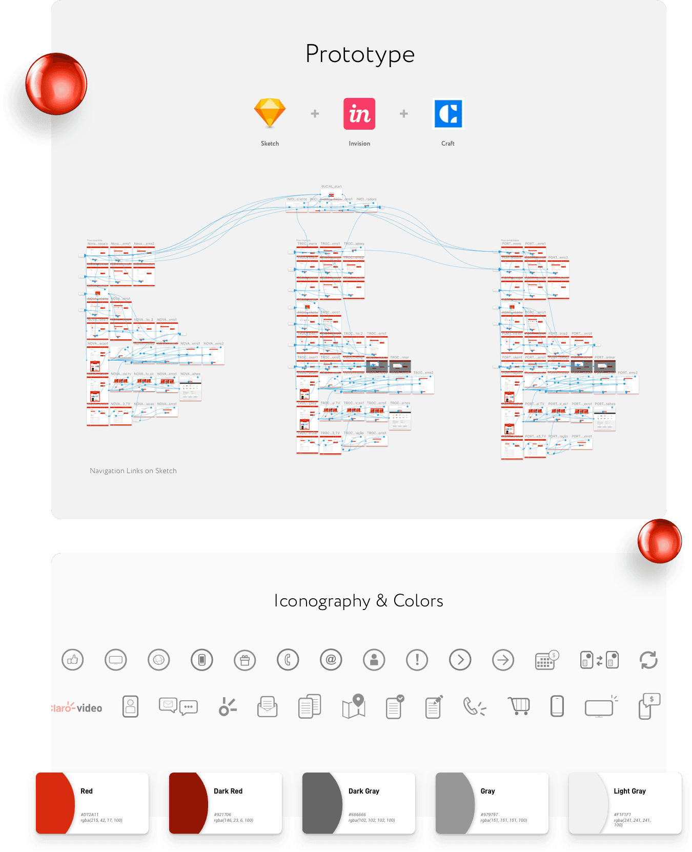
After iterative testing and UI refinement, we finalized the solution and rolled it out across all pages, supporting functional prototyping using Sketch and InVision. The project ran over five months and was delivered in two-week sprints.
New Brazilian accessibility regulations require e-commerce platforms to be usable by visually impaired users, including those who rely on screen readers and users with color vision deficiencies.
To meet these requirements, we carefully designed form feedback to be clear, redundant, and perceivable across different abilities—ensuring critical information is communicated effectively, even when it may appear repetitive by design.


We researched and analyzed different types of color vision deficiency to inform the design of our feedback system. This allowed us to create visual cues that remain clear and understandable regardless of color perception, ensuring form states and messages are accessible to all users.